KYND - Protien Oats
Logo & Packaging Design Case Study
Design Style
Logo
Packaging
Guidelines
Character design

Overview
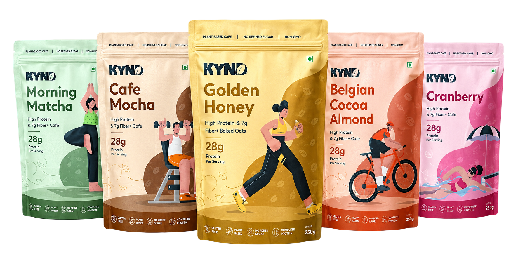
KYND is a modern protein-oats brand built around making everyday nutrition simple, delicious, and accessible. With a playful visual identity, vibrant flavours, and easy-to-understand product communication, the brand brings a fresh perspective to the traditional health-food category.
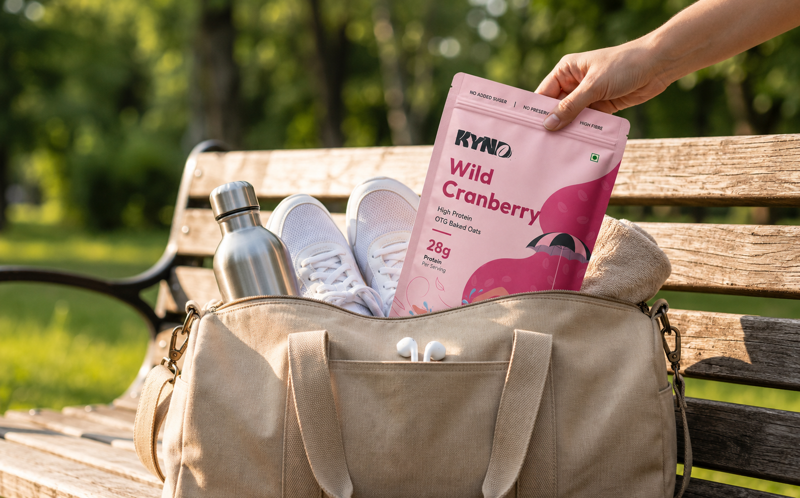
The design direction balances nutrition + energy + everyday lifestyle, positioning KYND as a product that fits naturally into busy mornings, workouts, and feel-good routines.
Brand Challenge
Make protein oats feel exciting, approachable, and relevant to everyday consumers.
Design Approach
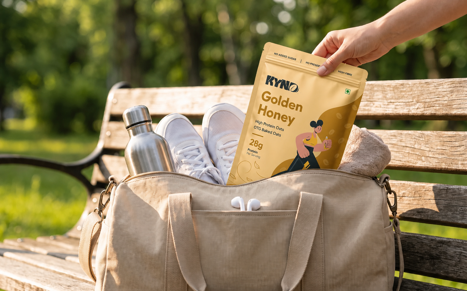
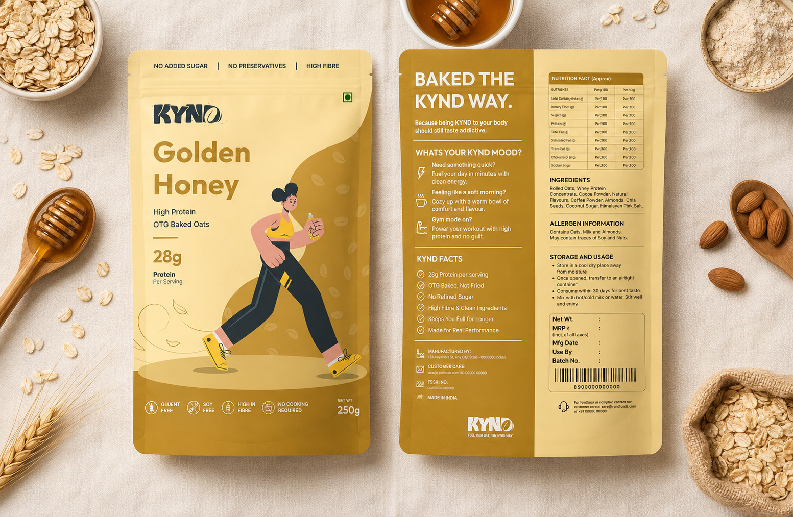
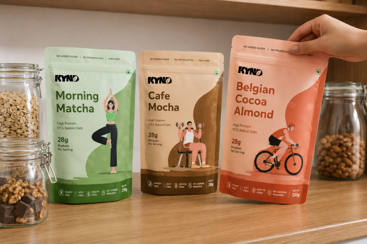
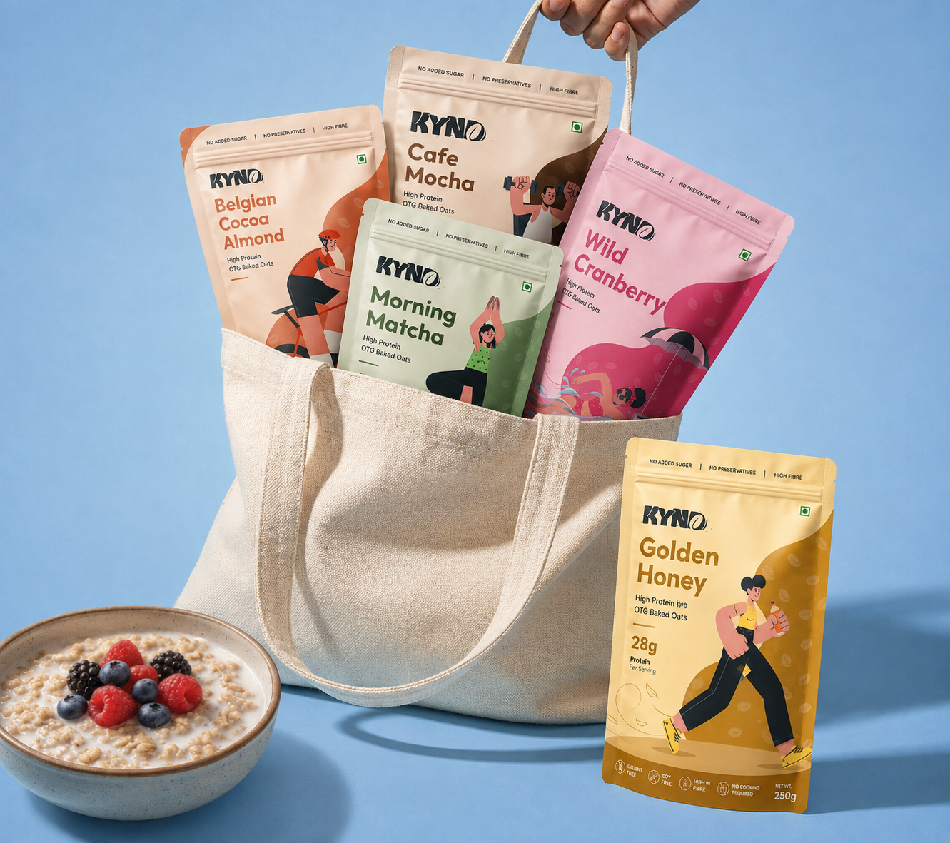
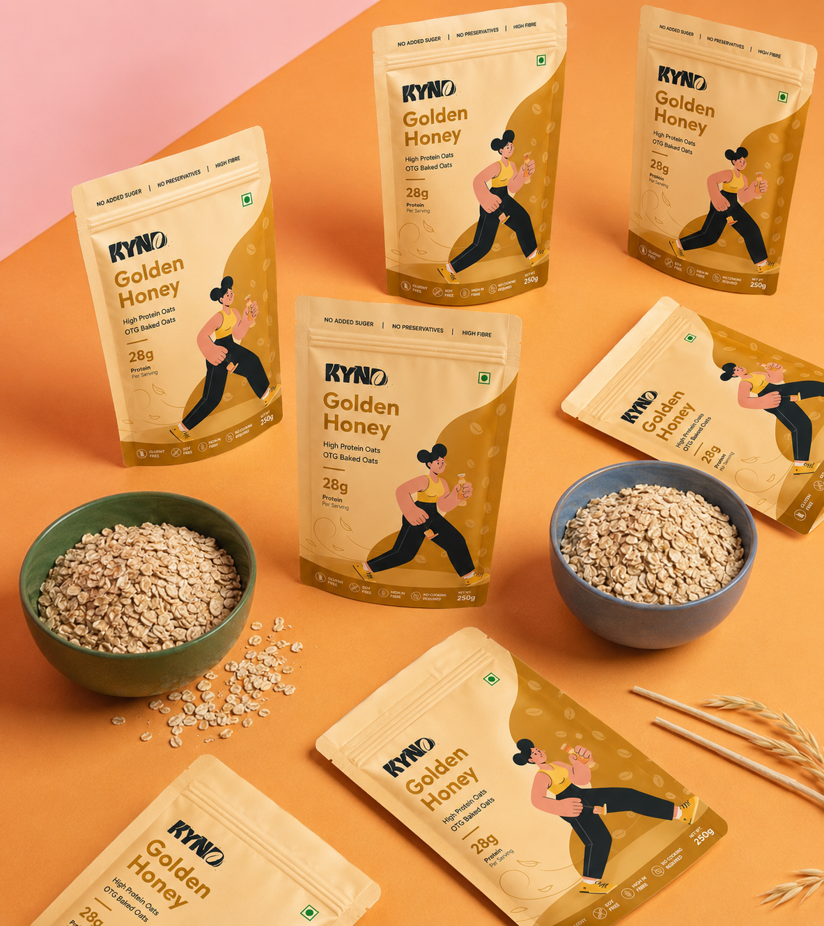
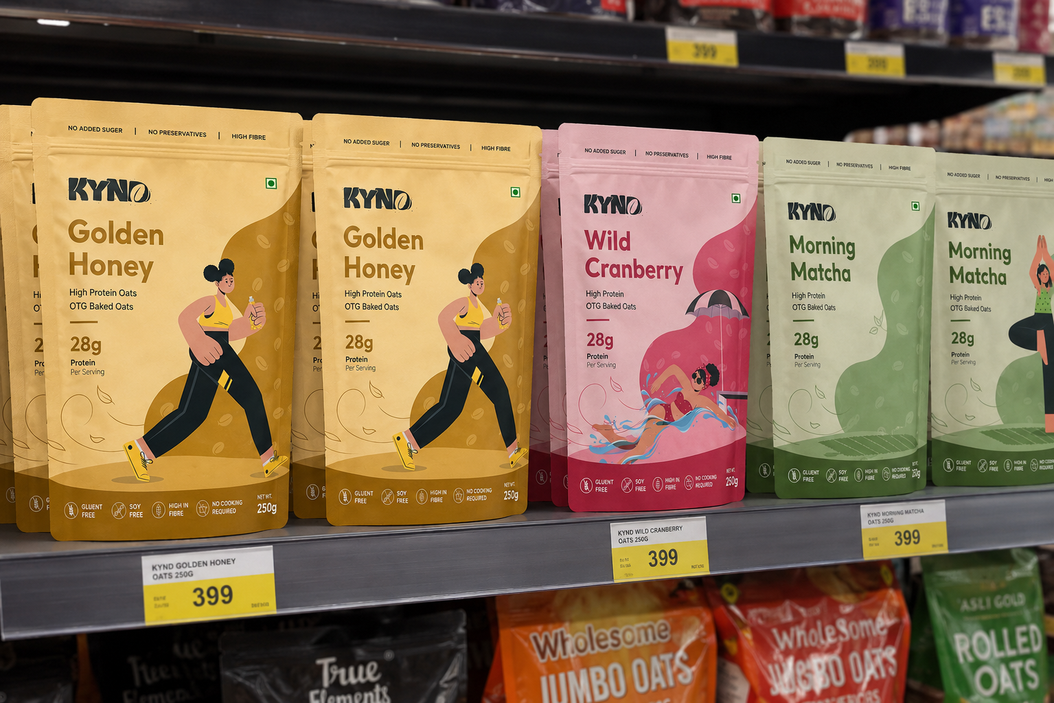
Blend bold typography, vibrant packaging, warm photography, and playful visual elements.
Positioning
Everyday protein nutrition made simple, tasty, and full of energy.
Touchpoints
Packaging, Retail, E-commerce, Social & Campaigns.


Oat / Seed Element
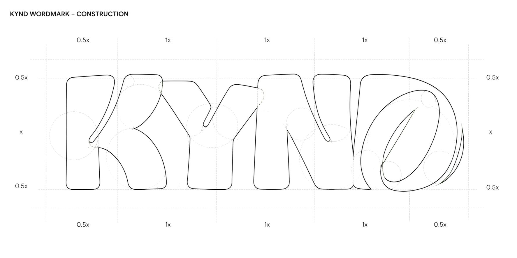
The oat-inspired form in the”D” created a direect visual connection with our core product - oats it reinforces natural ingredients, nutrition an the goodness inside every bowl.
Micro Particles
The small particles introduce a sense of crunch, movement and playfulness, reflecting KYND’s fun and crave-worthy personality.
Soft / Organic Letterforms
The soft, rounded letterforms create a friendly and approachable personality, making KYND feel less clinical and more indulgent.
OAT/SEED ELEMENT


WORDMARK EXPLOARATION

FINAL KYND LOGO


Brand Understanding
1. PROJECT OVERVIEW
Overview
We are developing a modern high-protein oats brand that makes healthy eating enjoyable, indulgent, and sustainable without compromising on nutrition or ingredient quality.
KYND focuses on taste-first, clean-label nutrition through OTG baked oats made with real ingredients and added whey protein. The brand aims to redefine oats as something exciting, crave-worthy, and performance-focused rather than bland or restrictive.
2. TARGET AUDIENCE
Audience
The target audience for KYND includes gym-goers, health-conscious consumers, young working professionals, fitness-focused individuals, and people looking for healthier breakfast or snacking options.
The brand is designed for consumers who want good taste and good nutrition together without compromising on indulgence, convenience, or ingredient quality.
3. BRAND PERSONALITY
Personality
The brand personality should feel modern, clean, trustworthy, vibrant, and premium yet approachable.
KYND should have a fun and energetic character while still communicating performance and nutritional credibility. The brand should make healthy eating feel exciting rather than restrictive, with a personality that feels crave-worthy, confident, and relatable.
4. DESIGN ELEMENTS
Design
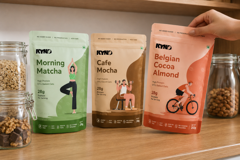
KYND uses oat and seed particles, ingredient-led visuals, bold protein callouts, baking-inspired elements, flavour-specific colours, and crunchy textures to create a premium, playful, and crave-worthy visual identity.
Color Palette
DD826A
EC7090
8EAD87
C7A04F
906746
Outfit Bold
1234567890!@#$%^(
abcdefghijklmnopqrstuvwxyz
AVCDEFGHIJKLMNOPQRSTUVWXYZ
Outfit SemiBold
1234567890!@#$%^(
abcdefghijklmnopqrstuvwxyz
AVCDEFGHIJKLMNOPQRSTUVWXYZ
Aa
Type Face


Aa
Inter Bold
1234567890!@#$%^(
abcdefghijklmnopqrstuvwxyz
AVCDEFGHIJKLMNOPQRSTUVWXYZ
Inter SemiBold
1234567890!@#$%^(
abcdefghijklmnopqrstuvwxyz
AVCDEFGHIJKLMNOPQRSTUVWXYZ
THANK YOU


for being kind to your body.


Want to see how we transform complex products?
View Other Case Studies


We diagnose user experience friction and design simple, high-converting digital products.
Contact Us


© Upsimpl 2026. All rights reserved.
KYND - Protien Oats
Logo & Packaging Design Case Study
Design Style
Logo
Packaging
Guidelines
Character design
Overview
KYND is a modern protein-oats brand built around making everyday nutrition simple, delicious, and accessible. With a playful visual identity, vibrant flavours, and easy-to-understand product communication, the brand brings a fresh perspective to the traditional health-food category.
The design direction balances nutrition + energy + everyday lifestyle, positioning KYND as a product that fits naturally into busy mornings, workouts, and feel-good routines.
Brand Challenge
Make protein oats feel exciting, approachable, and relevant to everyday consumers.
Design Approach
Blend bold typography, vibrant packaging, warm photography, and playful visual elements.
Positioning
Everyday protein nutrition made simple, tasty, and full of energy.
Touchpoints
Packaging, Retail, E-commerce, Social & Campaigns.


Oat / Seed Element
The oat-inspired form in the”D” created a direect visual connection with our core product - oats it reinforces natural ingredients, nutrition an the goodness inside every bowl.
Micro Particles
The small particles introduce a sense of crunch, movement and playfulness, reflecting KYND’s fun and crave-worthy personality.
Soft / Organic Letterforms
The soft, rounded letterforms create a friendly and approachable personality, making KYND feel less clinical and more indulgent.
OAT/SEED ELEMENT

WORDMARK EXPLOARATION
FINAL KYND LOGO


Brand Understanding
1. PROJECT OVERVIEW
Overview
We are developing a modern high-protein oats brand that makes healthy eating enjoyable, indulgent, and sustainable without compromising on nutrition or ingredient quality.
KYND focuses on taste-first, clean-label nutrition through OTG baked oats made with real ingredients and added whey protein. The brand aims to redefine oats as something exciting, crave-worthy, and performance-focused rather than bland or restrictive.
2. TARGET AUDIENCE
Audience
The target audience for KYND includes gym-goers, health-conscious consumers, young working professionals, fitness-focused individuals, and people looking for healthier breakfast or snacking options.
The brand is designed for consumers who want good taste and good nutrition together without compromising on indulgence, convenience, or ingredient quality.
3. BRAND PERSONALITY
Personality
The brand personality should feel modern, clean, trustworthy, vibrant, and premium yet approachable.
KYND should have a fun and energetic character while still communicating performance and nutritional credibility. The brand should make healthy eating feel exciting rather than restrictive, with a personality that feels crave-worthy, confident, and relatable.
4. DESIGN ELEMENTS
Design
KYND uses oat and seed particles, ingredient-led visuals, bold protein callouts, baking-inspired elements, flavour-specific colours, and crunchy textures to create a premium, playful, and crave-worthy visual identity.
Color Palette
DD826A
EC7090
8EAD87
C7A04F
906746
Outfit Bold
1234567890!@#$%^(
abcdefghijklmnopqrstuvwxyz
AVCDEFGHIJKLMNOPQRSTUVWXYZ
Outfit SemiBold
1234567890!@#$%^(
abcdefghijklmnopqrstuvwxyz
AVCDEFGHIJKLMNOPQRSTUVWXYZ
Aa

Type Face


Aa
Inter Bold
1234567890!@#$%^(
abcdefghijklmnopqrstuvwxyz
AVCDEFGHIJKLMNOPQRSTUVWXYZ
Inter SemiBold
1234567890!@#$%^(
abcdefghijklmnopqrstuvwxyz
AVCDEFGHIJKLMNOPQRSTUVWXYZ
THANK YOU


for being kind to your body.


Want to see how we transform complex products?
View Other Case Studies
We diagnose user experience friction and design simple, high-converting digital products.
Contact Us

© Upsimpl 2026. All rights reserved.
KYND - Protein Oats
Logo & Packaging Design Case Study
Design Style
Logo
Packaging
Guidelines
Character design




Overview
KYND is a modern protein-oats brand built around making everyday nutrition simple, delicious, and accessible. With a playful visual identity, vibrant flavours, and easy-to-understand product communication, the brand brings a fresh perspective to the traditional health-food category.
The design direction balances nutrition + energy + everyday lifestyle, positioning KYND as a product that fits naturally into busy mornings, workouts, and feel-good routines.
Brand Challenge
Make protein oats feel exciting, approachable, and relevant to everyday consumers.
Design Approach
Blend bold typography, vibrant packaging, warm photography, and playful visual elements.
Positioning
Everyday protein nutrition made simple, tasty, and full of energy.
Touchpoints
Packaging, Retail, E-commerce, Social & Campaigns.












Oat / Seed Element
The oat-inspired form in the”D” created a direect visual connection with our core product - oats it reinforces natural ingredients, nutrition an the goodness inside every bowl.
Micro Particles
The small particles introduce a sense of crunch, movement and playfulness, reflecting KYND’s fun and crave-worthy personality.
Soft / Organic Letterforms
The soft, rounded letterforms create a friendly and approachable personality, making KYND feel less clinical and more indulgent.
OAT/SEED ELEMENT

WORDMARK EXPLOARATION
FINAL KYND LOGO


Brand Understanding
1. PROJECT OVERVIEW
Overview
We are developing a modern high-protein oats brand that makes healthy eating enjoyable, indulgent, and sustainable without compromising on nutrition or ingredient quality.
KYND focuses on taste-first, clean-label nutrition through OTG baked oats made with real ingredients and added whey protein. The brand aims to redefine oats as something exciting, crave-worthy, and performance-focused rather than bland or restrictive.
2. TARGET AUDIENCE
Audience
The target audience for KYND includes gym-goers, health-conscious consumers, young working professionals, fitness-focused individuals, and people looking for healthier breakfast or snacking options.
The brand is designed for consumers who want good taste and good nutrition together without compromising on indulgence, convenience, or ingredient quality.
3. BRAND PERSONALITY
Personality
The brand personality should feel modern, clean, trustworthy, vibrant, and premium yet approachable.
KYND should have a fun and energetic character while still communicating performance and nutritional credibility. The brand should make healthy eating feel exciting rather than restrictive, with a personality that feels crave-worthy, confident, and relatable.
4. DESIGN ELEMENTS
Design
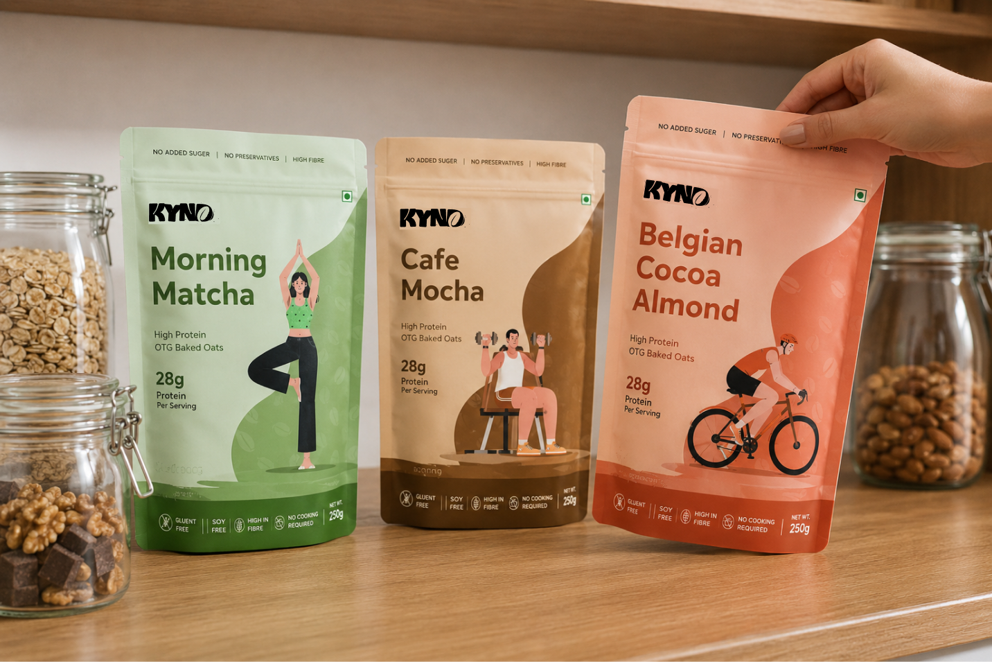
KYND uses oat and seed particles, ingredient-led visuals, bold protein callouts, baking-inspired elements, flavour-specific colours, and crunchy textures to create a premium, playful, and crave-worthy visual identity.
Color Palette
DD826A
EC7090
8EAD87
C7A04F
906746
Outfit Bold
1234567890!@#$%^(
abcdefghijklmnopqrstuvwxyz
AVCDEFGHIJKLMNOPQRSTUVWXYZ
Outfit SemiBold
1234567890!@#$%^(
abcdefghijklmnopqrstuvwxyz
AVCDEFGHIJKLMNOPQRSTUVWXYZ
Aa

Type Face


Aa
Inter Bold
1234567890!@#$%^(
abcdefghijklmnopqrstuvwxyz
AVCDEFGHIJKLMNOPQRSTUVWXYZ
Inter SemiBold
1234567890!@#$%^(
abcdefghijklmnopqrstuvwxyz
AVCDEFGHIJKLMNOPQRSTUVWXYZ
THANK YOU


for being kind to your body.


Want to see how we transform complex products?
View Other Case Studies
We diagnose user experience friction and design simple, high-converting digital products.
Contact Us

© Upsimpl 2026. All rights reserved.